Ironmongery · Brand concept · 2026
Fennick & Daughters
A brand for an old family ironmonger with a new side. Vintage lettering for the fascia and the van, and a friendlier look for the tool library, repair café and workshops.
- Logo
- Icon
- Badge
- Colour
- Type
- Illustrations
- Pattern
- Animation
- Website
Fennick & Daughters isn't a real company. It's a concept we created to show what a branding project with us looks like, from first logo to the website.
The brief
A proper ironmonger, since 1962. Now with a tool library, a monthly repair café and evening workshops.
Keys cut, nails by weight, a paper bag stamped at the till: the heritage had to stay, right down to EST. 1962 on the logo. The new side needed a warmer welcome, so anyone would walk in to borrow a hammer or get a teapot mended.
01
Logo suite
A stacked logo and a horizontal one for the fascia, all swashes and a gold nail. The nail F works on its own for small spaces, and a round badge carries the town's name.
- Primary · Olive on cream
- Icon · Olive on peach
- Reversed · Cream on olive
- Icon · Gold nail on olive
- Horizontal · Olive on cream

- Fascia and van · Cream and gold on olive

 On paper
Profile picture, app and browser tab.
For the membership card, the van doors and social. On the rubber stamp, use the nail F on its own, as the fine swashes can fill in with ink.
02
Colour and type
Olive and cream for the shop, a soft gold for the nail, and peach for the friendly side.
- Olive Leaf HEX #41521F RGB 65 82 31 The hero. Lettering, fascia and van
- Cream HEX #F5FDC6 RGB 245 253 198 The ground. Backgrounds and reversed lettering
- Soft Fawn HEX #D0B17A RGB 208 177 122 The gold. The nail on olive and the fascia gilding
- Peach Glow HEX #F5C396 RGB 245 195 150 The friendly side. Workshops, repair café and tool library
- Sand HEX #A89F68 RGB 168 159 104 Support tint. Cards and social backgrounds
 Bilderberg A bold vintage serif with a curly ampersand, for the logo and headlines. One or two swash letters at most, never a full set.
03
Illustrations and pattern
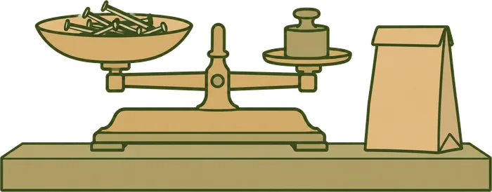
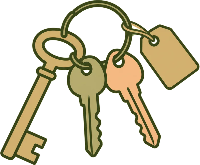
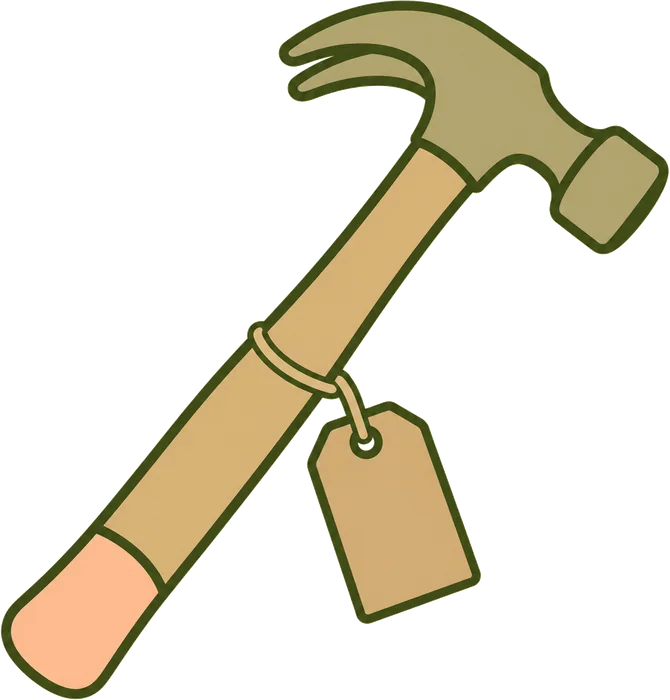
Four things from the shop, old and new, and a line pattern made from them. The illustrations sit best on cream, and the pattern works on peach or cream.
- The counter
- Keys cut
- Tool library
- Repair café
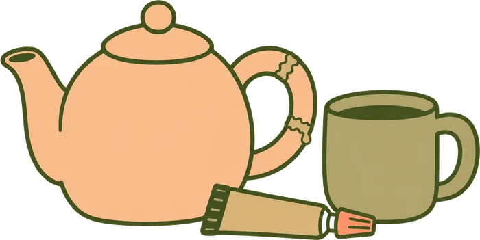
 Once a month, bring it in.
04
Logo animation
The nail drops in and the hammer taps the F into shape. It turns gold on olive, the letters bounce in with their swashes, then it flips to olive on peach and shrinks into the badge as the ring stamps down.
05
And a website to match
The logo animation opens the homepage, the old sign gets its new name as you scroll, and workshops, repair café slots and tool library membership are all bookable. Have a scroll around, it's fully clickable.
Want a brand like this?
Branding from £345, or £29 a month, and a website to match when you're ready.